ART DIRECTION, BRANDING, LAYOUT DESIGN
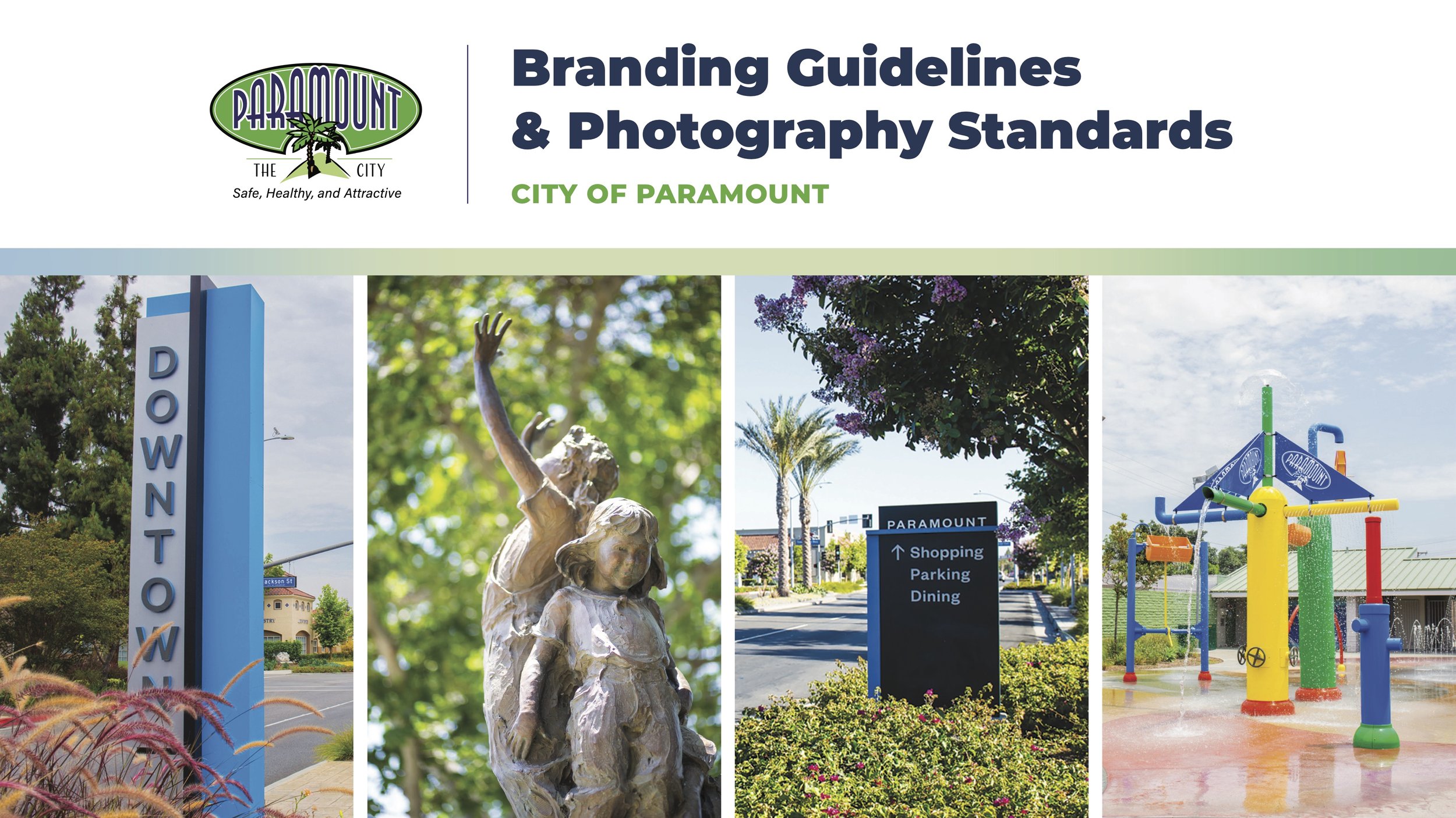
The City decided to create a comprehensive branding guide to achieve and ensure consistency while protecting its identity. As the Lead Designer for this project, the overall goal was to set visual standards and expectations to use across internal and external graphics.
The City’s Branding Guide
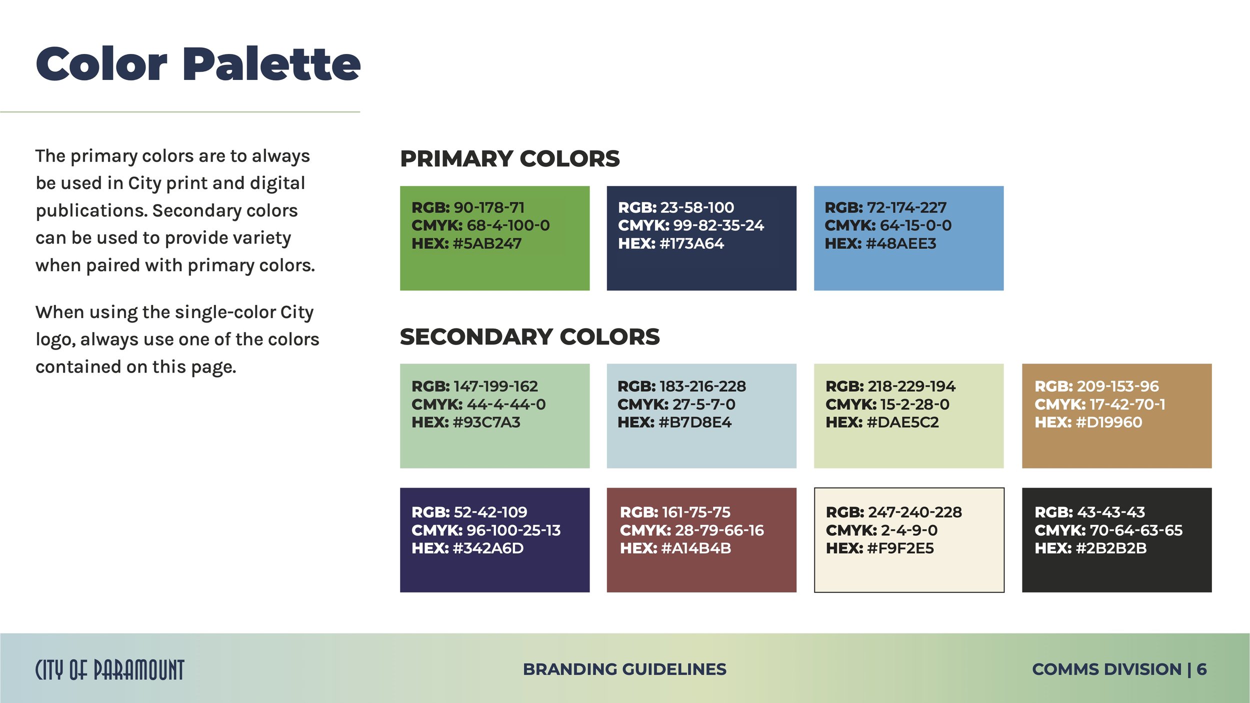
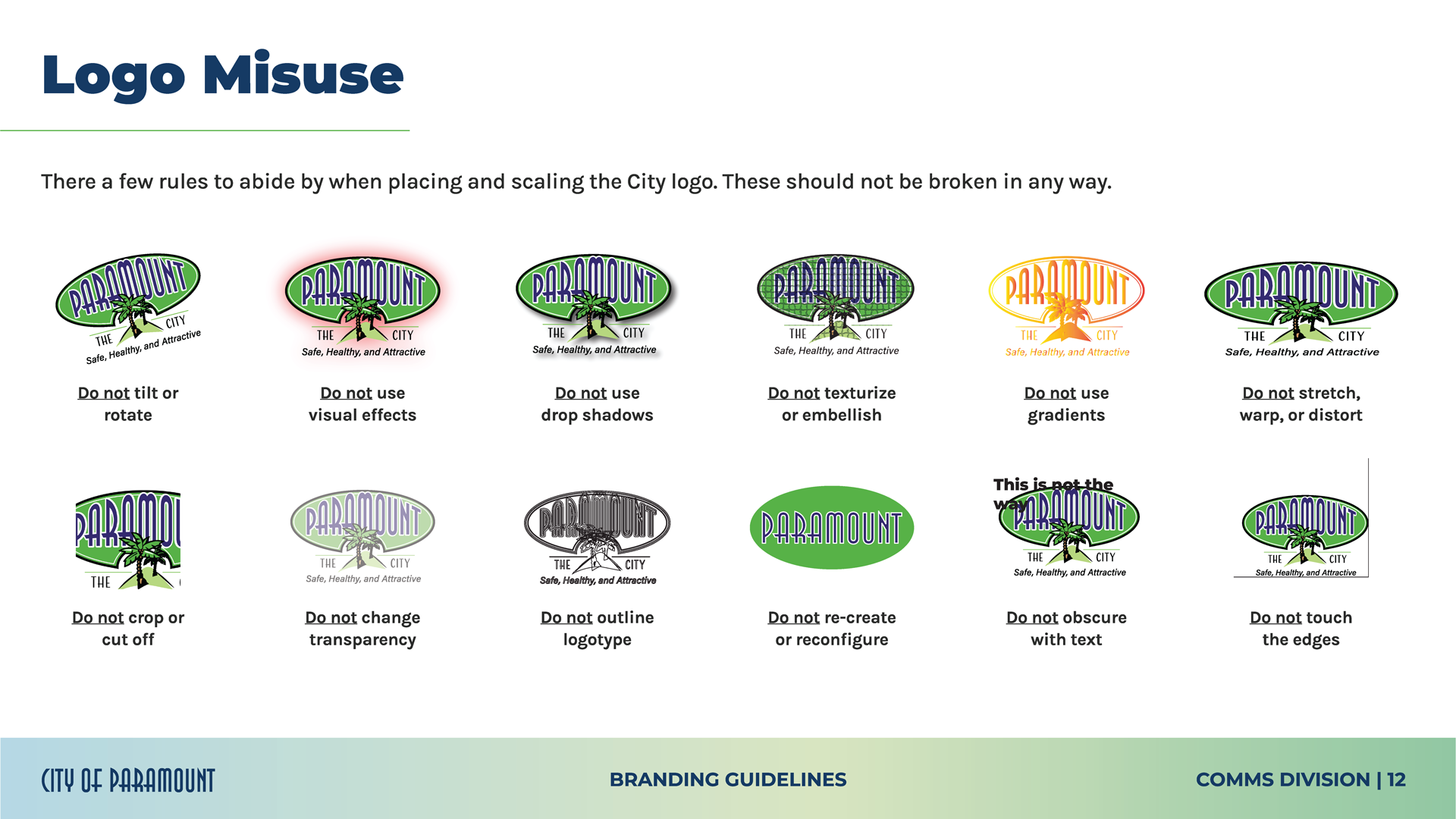
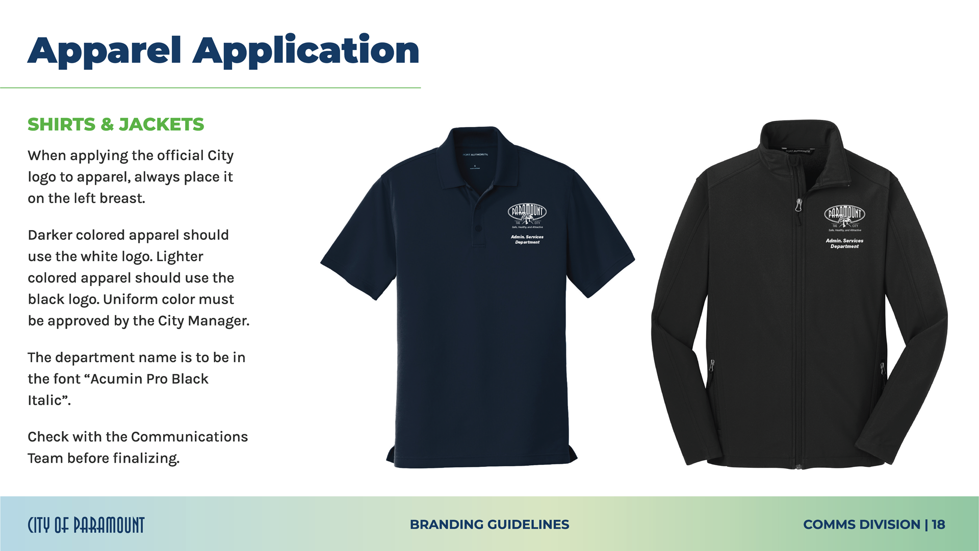
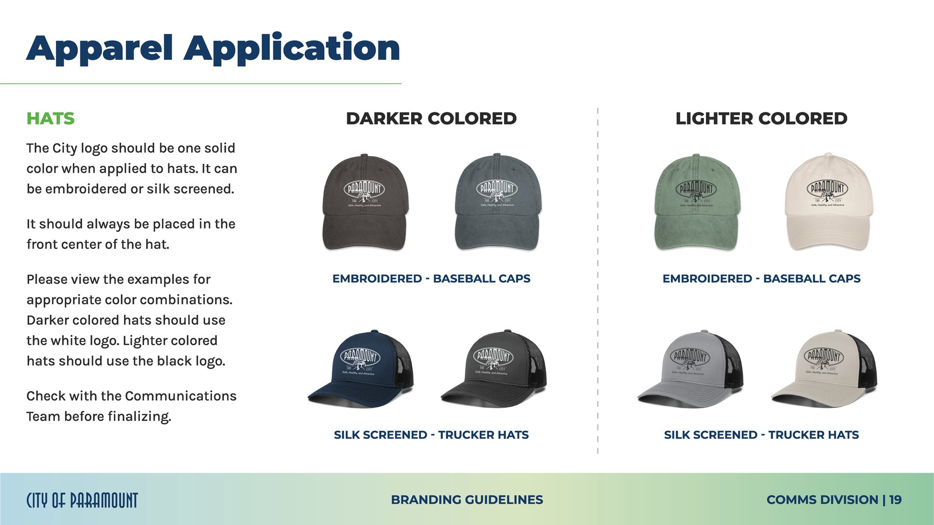
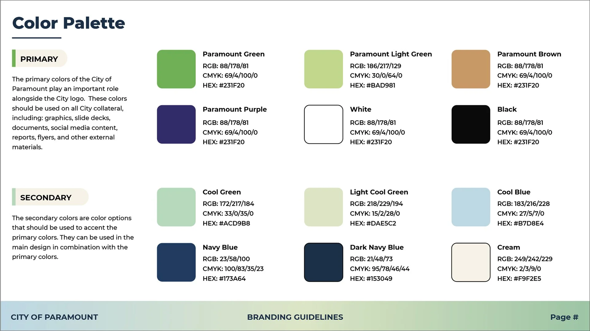
Highlighted pages from the Guidelines
Research & Development
The start of every big project starts with research. While overseeing the production process, there had to be a starting point.
The City of Paramount already had an official logo, so the question was: how do we create a guide/theme around it?
The findings were documented to get a better sense of what could be included in our guide.
Key Takeaways
With the visual findings completed, it all came down to asking the big question: what do we include? Throughout the visual research, we discovered key takeaways that appeared in all of the researched guidelines. Here are some key takeaways that our Communications Team highlighted.
Creating the Base File and Layout
After a series of meetings amongst the Communications Team, the document started to take form with a layout and color scheme. The draft versions were created in InDesign. The beginning stages were rough on the edges.
The Refining Era
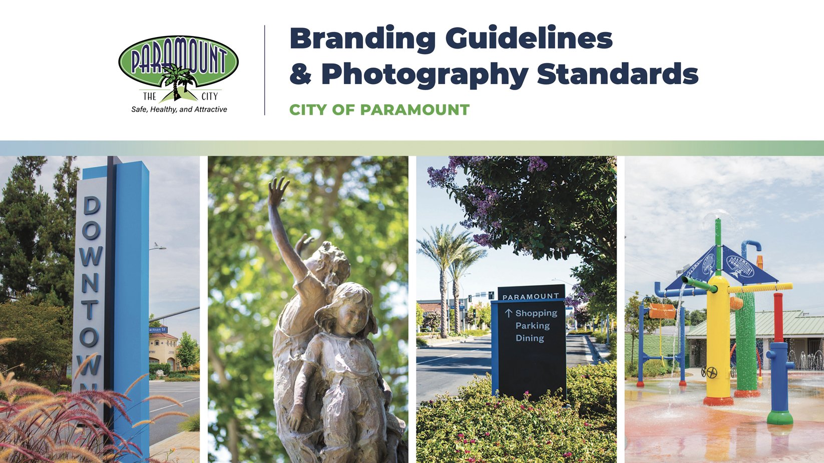
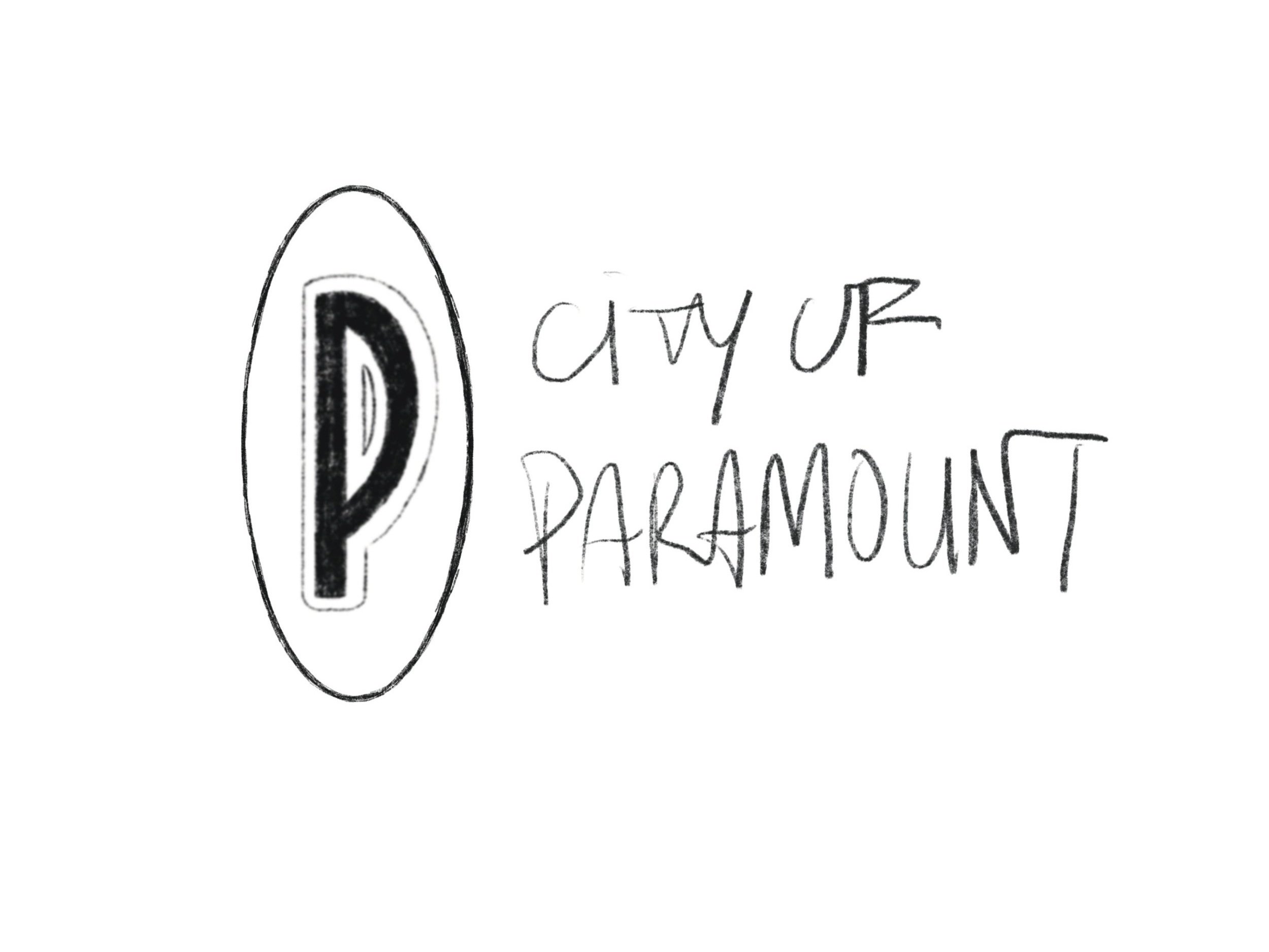
With the base file/layout created, our team pondered on how to push the design a bit more and take it to the next level. The overall design was refined which included a brand-new front cover, a new footer, and a place for an alternative logo. Before this project, the City did not have an alternative logo to use in smaller instances. As a group, we decided to create one that was on par with the official City logo.
With the help of our trusty Public Information Officer, I was able to refine and polish up all of the body copy to make it more concise.
Evolution of the Paramount Alternative Logo
Step 1. Sketchy version of a logo idea
Step 2. Rough variations to match the City logo
Hooray! Final edition with type variations
The Project Outcome
As the project came to a close, it was presented to the City Council at the September 12 Council Meeting.
The overall project was an interesting learning experience in several ways. For one, I grew my expertise in communications both verbal and written. It was a nice opportunity to work alongside a remarkable group of people who know their fields really well in design and communications.


