ART DIRECTION, CUSTOM LETTERING, POSTER DESIGN
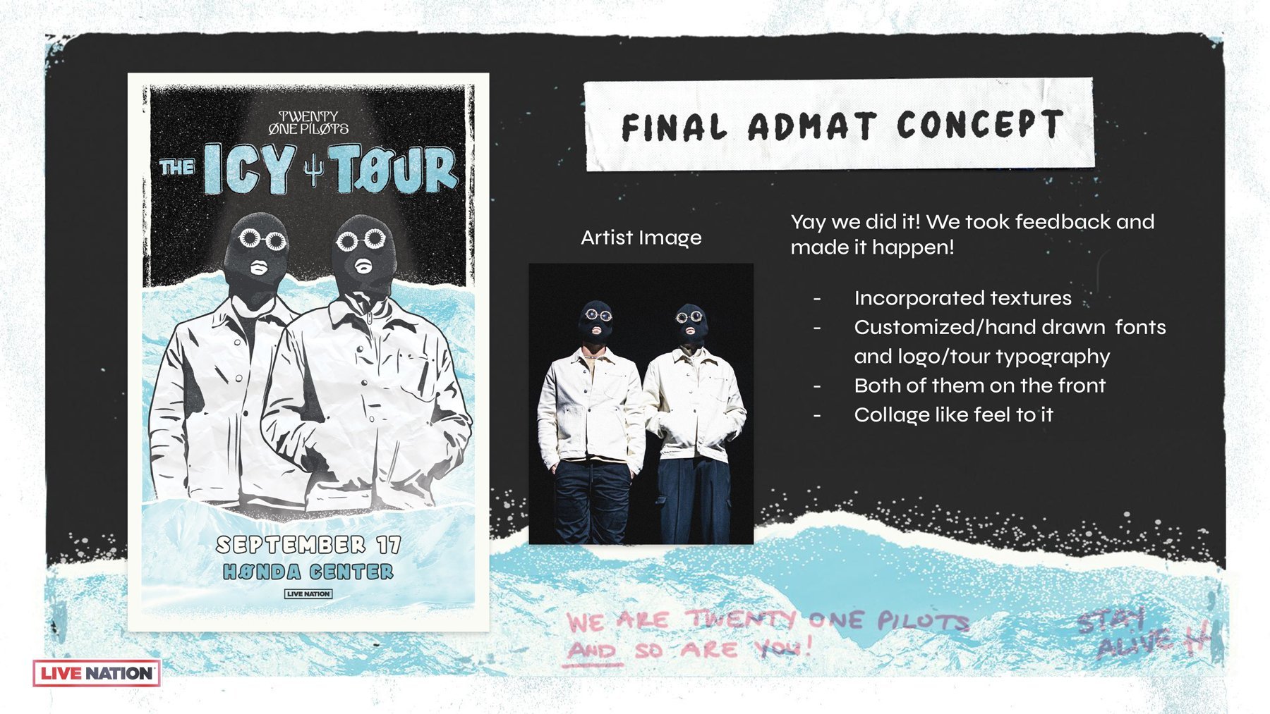
“The Icy Tour” Admat Design
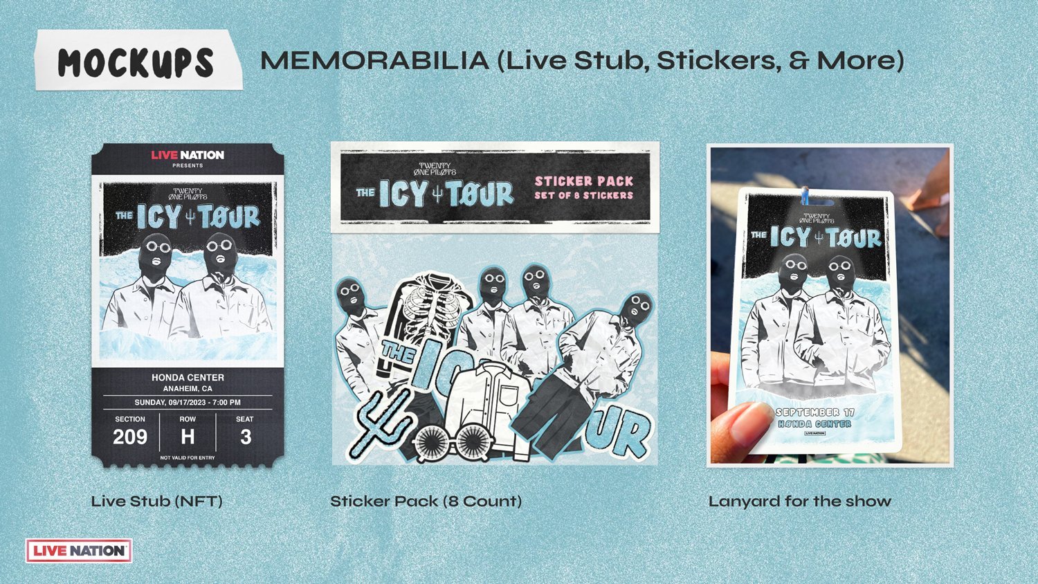
This conceptual tour design was created solely for my final project at Live Nation Entertainment. The project focused on designing a tour admat and overseeing the production process from conceptualization to the end product. I got to choose my artist and design all the artwork for their upcoming/conceptual tour.

Research & Development Process with Questions
The starting point consisted of various types of research:
Looking back at their previous tour artwork
Illustration style vs. photo manipulation
The circled poster (Better Call Saul) was the direction for the illustration style due to the use of a very minimal palette.
The scribbled poster (twentyonepilots) was one of their first tour admats and I wanted to incorporate the same collage look/feel.
Trying to figure out the illustration & collage style
The first round of drafts were not making the cut. These were placed in a REJ folder for now.
The final round of drafts heading in the right direction. The look was coming together.
Custom Tour Typography
The typography started out as simple hand lettering with several sketching phases. This handmade typography also ties into the custom fonts built for this project which can be seen below.
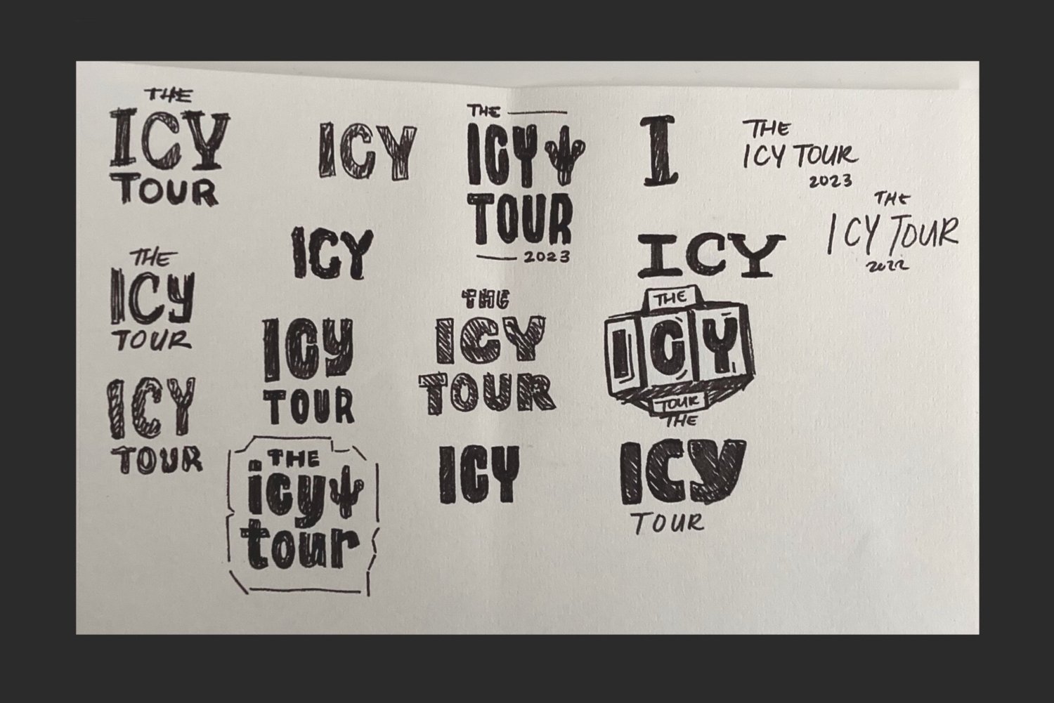
Sketched out marker comps of what the style could be

The two fonts that were hand created for this specific project

The final tour logo or should I say custom typography